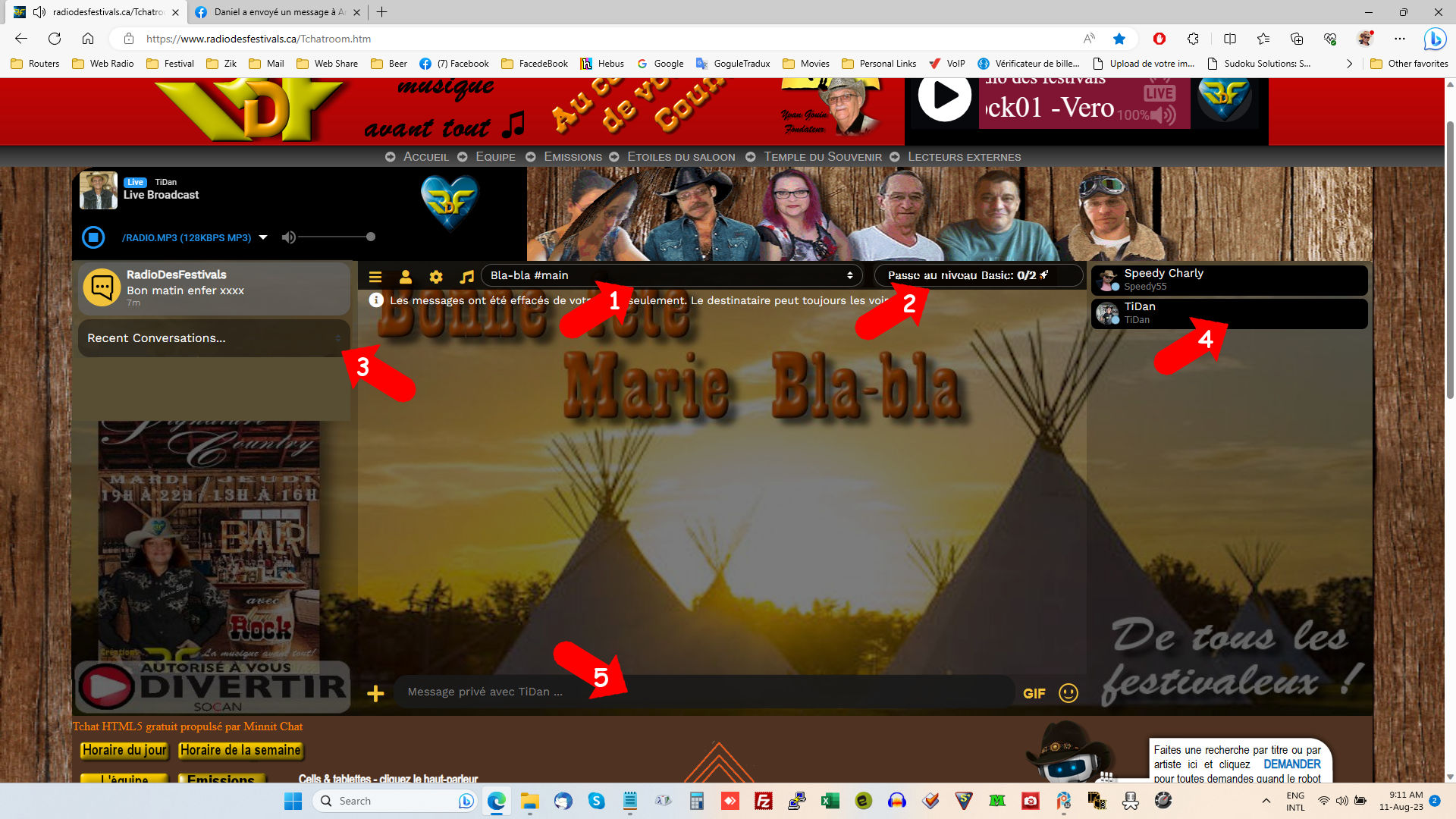
Knowing that screen ‘real-estate’ is at a premium on PC’s, and especially on cell phones, here are a few suggestions for making maximum use of image area;
Reduce width of ‘Current Chat’ bar,
Move ‘Boost’ to freed space,
Move remaining bars up, maximizing space for key background graphics. Further, do back bars need to be so opaque?
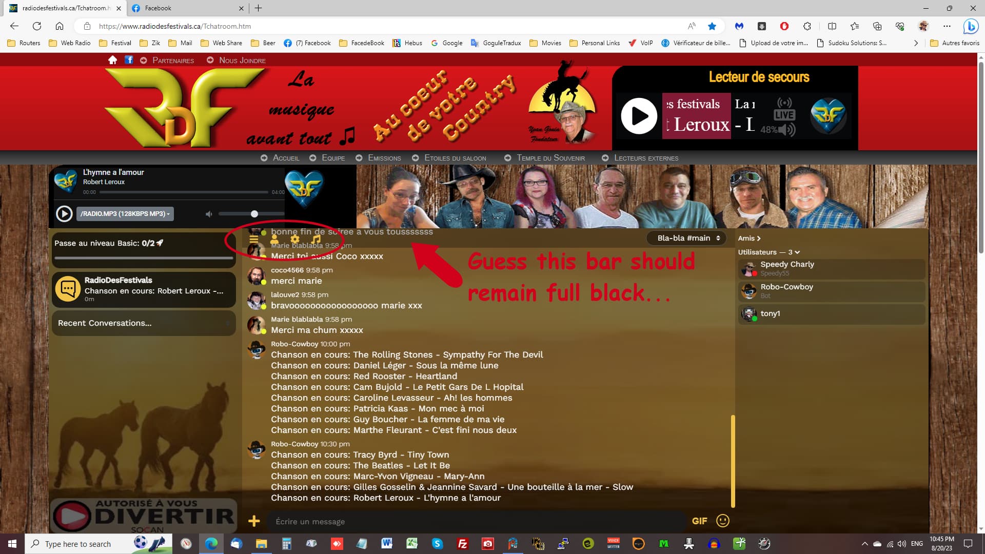
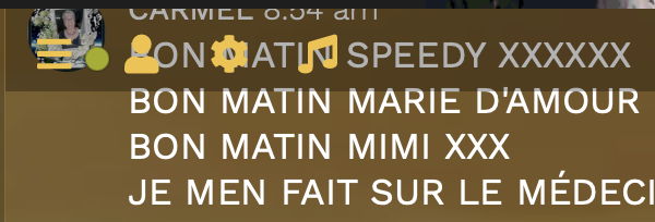
Does back bar on user names really have to be full opaque, totally blocking background image?
Why leave a few pixels of space below the ‘Message’ bar? Waste of space… move it all the way to bottom.
Haven’t forgotten about this, juggling other things, but definitely good stuff. Will:
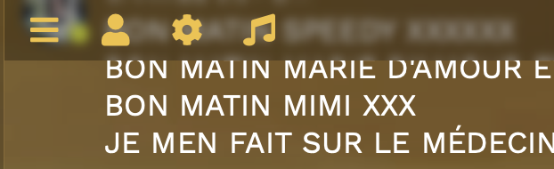
reposition the text box so it’s less off-center on the Y axis
make the black bars / user list elements / DM elements more transparent on chats with “spread background”
Regarding top bar & putting more things in it / shrinking others down: It all factors in to the fact that it must play nice with chats of all sizes & feature sets. If your width of the chat is only 300px wide or so, and you have the standard Menu+User+Gear icons, plus optional Radio, and you’re also on mobile so you have User List + DM button, and the chat has Bookmarked messages set up, then there’s not much room for the channel picker (if channels are enabled). It’s set to size itself to fill in whatever space remains (and if there’s no space that remains then it shifts to its own line).
Could make it so the channel picker is only as wide as the longest channel name though, just so it’s not comically wide for no reason.
Moving “Boost” stuff to the top bar is definitely an interesting idea, but I’d have to make it only do that if there’s a fair amount of space available, otherwise it stays where it’s at (the left). May not be worth the fuss, especially since some users may see it in one spot and others on another spot (depending on their display size). I’ll test it out for sure though.