I recently made a “upgraded” version of the minnit logo. This is just a little fun project I made for myself. If you have any suggestions let me know please!
1 Like
Honestly, if I remade the Minnit logo I would get rid of the clock arms completely. Have a big bold M in the middle, and the lines around representing time can stay. Of course, the M would need to be either custom or an adjusted sans serif. This would make it simple, clean, and easily recognizable. Not only that, but it would allow for universal flexibility as a logo much like Google’s.
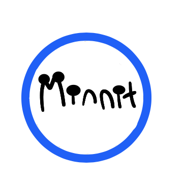
I just happened to come across an old logo from before we launched:
After soliciting feedback I eventually changed it to the design we all know today.
If I had to remake it though, I’d get rid of the gradient and dim the lines a bit. This is just a quick mockup, haven’t tested it in various sizes or anything to make sure it looks good:
The fact that people can see it and recognize “M” and “Clock” makes it great for a company called Minnit, “a fast and easy way to get a chat set up”! So I’d hate to deviate too far from that, although I do admit I’m biased…
1 Like
not very good at drawing letters on my drawing site Kleki. i tried making it look like the og with some similarities
Oh, you use Kelki? I’m amazing at drawing on that site. If you need help just Dm me!
I do! I found out from other students at my school and ever since that I’ve really liked using it.
If I had to remake it though, I’d get rid of the gradient and dim the lines a bit.
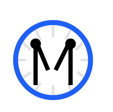
Few months later, here we are…
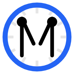
Pretty subtle changes, but I just set out to improve upon the existing logo, rather than make something different just for the sake of being different. The logo is a solid blue instead of a gradient, the lines on the clockface are more subtle, and the clock hands are bolder and have a line-cap.
Just the same logo we had, but more modern. You may not even notice a difference! But that’s fine with me ![]()
Hello to all of you, I have an idea if you put a diamond in the middle of the letter M, it would be great because the time is very prominent and the look of the diamond would be great for it.thank you ![]()
put a diamond in the middle of the letter M
Very interesting idea — may be a neat concept for a background in your chat?
I like diamonds, I wanted to tell you that if you put a diamond in the middle of the letter M in the logo, it will be very beautiful, and you know better:smiling_face_with_three_hearts:![]() .
.