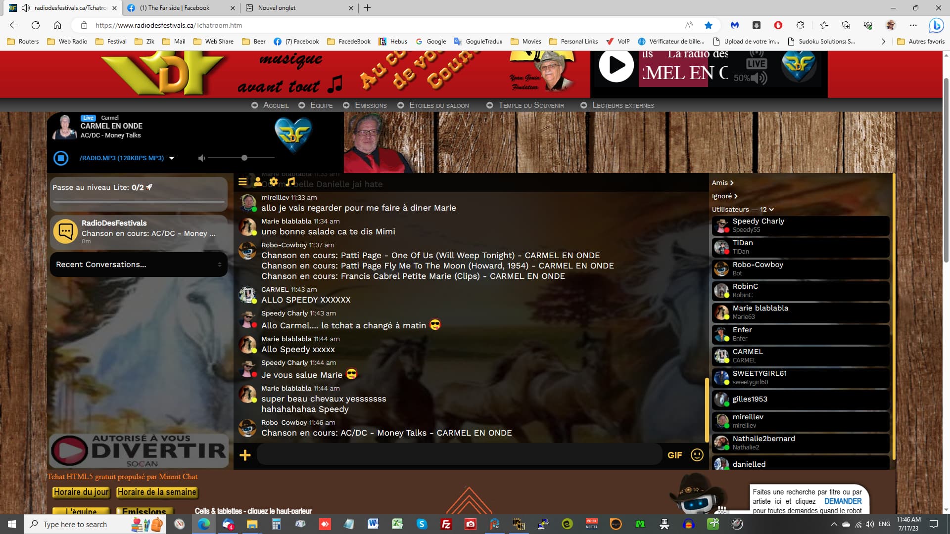
Perso, I’m a fan of “Why fix what ain’t broke?” but I realize that change is inevitable. That said, not all change is for the better. The semi transparent screens under the text and users section are now too dark and greatly lessen the quality and visibility of the graphics we place as background. (See image below) Please add an option to control transparency of such screens or turn them off altogether. The ‘Message bubble’ option should be enough to take care of text readability over graphics and should offer variable transparency settings also…
The menus added above the User list make it necessary to scroll deeper to see it all; might have been a better idea to add these to the menu bar that was moved above the message section. And, BTW, there is no real gain in moving that menu bar to the top… message box and menu bar at the bottom had the advantage of being close together, reducing mouse travel…
Thanks — I’ve brightened backgrounds that are set to “spread to entire chat” so they’re more viewable.
Will keep the other stuff in mind for sure, we’re trying to find the perfect mix of “not being too confusing when compared to other apps” (something that some owners find to be the case when being onboarded) and “being good to use”… Appreciate the feedback!
Guess you had lightened it too much for some operators’ taste… darkened it back some… which makes my point that we should have a button to dial in transparency/darkness according to our preferences and according to the graphics we set in the bj… also should extend that function to the speech bubbles, all with more color choices (tones of gray mayhaps)
On the new top menu bar; sound and gear icons work just fine - person icon…the sweet spot is off to the right of the icon and hamburger icon doesn’t seem to work at all…
we should have a button to dial in transparency/darkness according to our preferences and according to the graphics we set
Not a bad idea, we’ll look into that at some point and see how we can make it easy to explain to folks.
On the new top menu bar; sound and gear icons work just fine - person icon…the sweet spot is off to the right of the icon and hamburger icon doesn’t seem to work at all…
I’ve put your chatroom back on the old design for now so it’s usable.
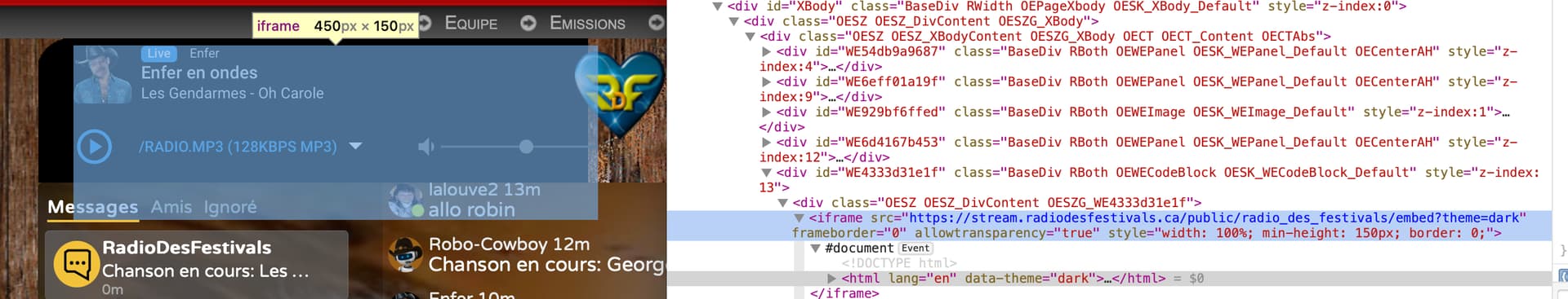
When investigating what happened I saw the culprit:
Your radio player iframe element is overlapping the chat. So in the old design or new design, that entire area is dead space. On the old design, users may have issues with their friends list, depending on their display size (applies to me).
I’ll keep your chatroom on the old design for a bit since the menu button is more important than friends (in my opinion) but it’s definitely worth investigating on your end…
Funny, thanks for the heads-up… here I was thinking that my iframe was the same size and the black rectangle behind it…
Fixed the iframe overlap issue by elevating the chat to the foreground layer (which is where it was originally)… your new chat geography should now work on our page
Thanks Jesse; sometimes it’s useful to have a second pair of eyes